
Elements
Everything on a Freeform Sheet page is an element. To create one, open the editor and click a type in Add element; it appears in the middle of the visible area, ready to be dragged. To create elements already linked to the system's data, use Sheet data.
| Type | What it is for | Can be linked to |
|---|---|---|
| Text | Fixed labels and titles | — |
| Field | Showing and editing a value: name, hit points, level | Character, item or custom value |
| Checkbox | An on/off value | Character, item or custom value |
| Box track | Counters and tracks: hero points, stress, spell slots | Character, item or custom value |
| Image | The character's portrait or a fixed image | — |
| Roll | A button that rolls | An item, a formula or a system roll |
| Rich text | Long formatted text: biography, descriptions | Character or item |
| Item list | The character's items, updated on its own | An item type |
| Shape | Decorative rectangles and circles | — |
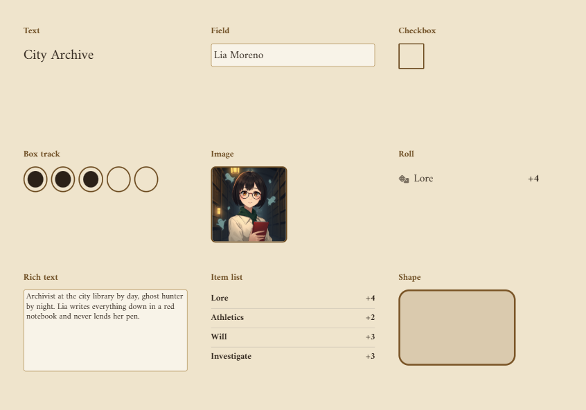
In the panel, each element has the Position, Data (when it can be linked), Options and Style parts. Linking to data is explained in Data links.
Text
Fixed text that does not change with the character. Use it for labels and titles that are not drawn in the art.
| Option | What it does |
|---|---|
| Text | What shows. Accepts several lines. |
Field
Shows a character value and lets you edit it, like on the system sheet.
| Option | What it does |
|---|---|
| Input | Single line, Number or Multiple lines. Number only accepts numbers. |
| Stored as | Plain text or HTML (FateX aspects), for data the system stores as HTML. The field shows clean text and saves in the right format. |
| Placeholder | The grey text shown when the field is empty. |
| Show + on positive numbers | Shows +2 instead of 2, for modifiers. |
| Read-only | Only shows the value, without letting you edit it. |
Values the system calculates on its own are always shown read-only.
Checkbox
A box that turns a value on and off.
| Option | What it does |
|---|---|
| Bit | -1 for a normal on/off value. 0 or more uses one bit of a number, like FateX stress boxes. |
| Inverted | The box shows ticked when the value is off. |
| Mark | Cross, Check, Filled or Dot. |
| Shape | Square or Circle. |
| Mark color and Box outline | The colors of the mark and of the box border. Without an outline, an unticked box is invisible: that is how you use the boxes already drawn in your art. |
Box track
A row of boxes linked to a single value.
| Option | What it does |
|---|---|
| Marking | Counter (first boxes marked), for hero points or dying: the value is how many boxes are ticked. Independent boxes (bitmask), for FateX stress: each box is ticked on its own. |
| Number of boxes | How many boxes to show. 0 uses the number from the data, such as the maximum focus points. |
| Columns | How many boxes per row. 0 puts them all in one row. |
| Gap | Space between the boxes, in pixels. |
| Show box labels | Shows each box's label, when the data has one. |
The Mark, Shape and color options are the same as the checkbox's.
In counter mode, clicking a box ticks up to it; clicking the last ticked box unticks it. Data stored as a list of true and false works too: each box is one entry of the list.
Image
| Option | What it does |
|---|---|
| Shows | Character portrait or Fixed image. |
| Fit | Cover, Contain or Stretch. |
| Image or video | Fixed image only: the file or address. Videos play in a loop, without sound. |
In play mode, clicking the portrait opens the file browser to change the character's image. Those who cannot upload files only see the enlarged image.
Roll
A button that rolls. Rolls are always the system's, with the same dialogs and chat cards as the system sheet.
| Option | What it does |
|---|---|
| Rolls | The linked item (skill): rolls one of the character's items, such as a FateX skill or a weapon. A dice formula: rolls the formula you write. A roll of the system (skill, save, strike…): picks from a list of the rolls the system offers. |
| Button text | The text of the button. Empty, it uses the item name. |
| Formula | For A dice formula: a Foundry formula, such as 1d20 + @abilities.str.mod. @ reads the character's roll data. |
| Roll | For A roll of the system: the chosen roll, grouped by type. |
| Show rank or modifier | Shows the skill rank or the modifier next to the name. |
| Show the name (off: only the number, for shapes drawn on the art) | Off, the button shows only the number, to fit a space the art already labels. |
| Show dice icon | Shows a die on the button. |
The list in A roll of the system changes from one system to another: ability checks, saves, skills, initiative and strikes, for example. See what each system offers in Systems.
Rich text
Shows formatted text, such as the character's biography or a stunt's description.
| Option | What it does |
|---|---|
| Editable | Shows a pencil that opens Foundry's text editor. The text is saved with Save and close. |
Item list
A list of the character's items that updates on its own: new items show up, deleted items disappear.
| Option | What it does |
|---|---|
| Item type | All items or one type. Systems with dedicated support also offer the lists of the system sheet, such as the weapons of the inventory or the spells of a level. |
| Shows | Name, Name and rank, Name and description or Name and details, such as action cost, attack and damage, or uses. |
| Clicking an item | Opens its sheet, Rolls (on D&D 5e and Pathfinder 2e, uses the item the system's way), Posts it to chat or Nothing. |
| Row height | Height of each row, in pixels. |
| Show item images | Shows each item's icon. |
| Show add, edit and delete buttons | The + creates an item of the list's type; the pencil opens the item's sheet; the trash can deletes it, after confirming. |
Items dropped on a list go into it, when the system has dedicated support. Right-clicking an item always opens its sheet.
Shape
A rectangle with no content. Use it to draw boxes, bands and frames behind the fields when you have no artwork, or to highlight part of the artwork. Its look comes entirely from Style: Background, Border and Corner radius. With a large corner radius, the shape becomes a circle.
Style
The Style section changes the look of any element. Elements with text have every option; images, checkboxes and shapes only have the ones in the second table.
| Text option | What it does |
|---|---|
| Font | Page default or one of Foundry's fonts, including the ones the GM added to the world. |
| Size | Font size in pixels. 0 uses the page default. |
| Weight | Normal or Bold. |
| Text color | Empty, it uses the page's default color. |
| Alignment and Vertical | Position of the text inside the element. |
| Line height and Letter spacing | Space between lines and between letters. |
| Italic, Uppercase, Text shadow | The shadow helps to read light text on a detailed artwork. |
| Box option | What it does |
|---|---|
| Background | Color behind the element. Empty, the element is transparent and shows the art. |
| Border and Border color | Thickness and color of the border, in pixels. |
| Corner radius | Rounds the corners. |
| Padding | Space between the border and the content. |
| Opacity | From 0 (invisible) to 1 (normal). |
With several elements selected, style changes apply to all of them. The default text of the whole sheet is in Background and size.